Personal project · Solo design & engineering · 2026
Blipflip
An hourly video diary for a small circle — designed, branded and built solo. Now live on the App Store and Google Play.
The problem
Daily-video apps die because they demand performance. An hourly diary only works if capturing takes seconds and sharing feels private by default.
What I did
Set the entire visual direction solo — mark, crayon palette, UI spec, motion, store listing — and built the app: React Native, a photo-to-sticker flow, and native widgets.
Where it landed
Launched on the App Store and Google Play, from solo product design and engineering through to both store listings.
Your day, two seconds at a time.
An hourly video diary. No feed, no followers, no likes — just your real day, an hour at a time, shared with the people who matter.
The dark panels below are the app's own brand-identity page, transcribed into components — same tokens, same geometry, on the ground the identity actually specifies.
A diary you'll actually rewatch
Blipflip turns an ordinary day into a little movie — one honest, unpolished frame at a time.
An hour, a Blip
Every hour, a gentle nudge: turn your phone sideways, hold to record a few seconds, done. By evening the clips stitch into a vlog worth keeping.
Private by design
Shared only with a squad of close friends or one partner. No public feed, no follower count, no performance — just being in the same room all day.
Blip your day. Share it with the people who matter.
Overview
Blipflip is a private video-diary app I designed and built end to end as the sole engineer and designer — one React Native codebase powering both iOS and Android, plus the brand it ships under. Every hour it nudges you to record a couple of seconds; by evening those clips are a vlog you share with one squad or one partner, and nobody else. It's a personal project, but I treated it like a production app: a proper design system, photo-to-sticker cutouts, native platform widgets, and local capture with cloud sync.
My role
Solo product designer and full-stack mobile engineer. I owned everything from the initial concept and UI design in Figma to the React Native implementation, the Supabase backend, the native iOS/Android widget code, and the identity the whole thing is dressed in.
The design decisions behind it
The identity is the visible half. Underneath it, Blipflip is a set of interaction and product decisions about how much a diary app is allowed to ask of you.
A capture gesture with no menu
Turn the phone sideways, hold to record, let go. There is no mode picker, no length setting, no post-processing step — the interaction is short enough that it doesn't need instructions, which is the only way an hourly prompt survives past week one.
Privacy you can see before you record
Who a clip goes to is a property of the squad or couple you're in, and it's surfaced in the capture UI rather than buried in settings. People will only post an unedited day if they can tell, without checking, exactly who is on the other end of it.
A nudge that doesn't nag
Hourly reminders and a visible streak are the engine, but the voice rules on this page rule out shaming anyone into either. The reminder states, the streak display and the empty states were all written and designed to stay on the encouraging side of that line.
One system across three surfaces
The app, the home-screen widgets and the store listing are all built from the same tokens and the same mark. Widgets got their own lighter treatment, since they live on someone's home screen next to apps that aren't mine — but they're derived from the system, not drawn separately.
One happy little character
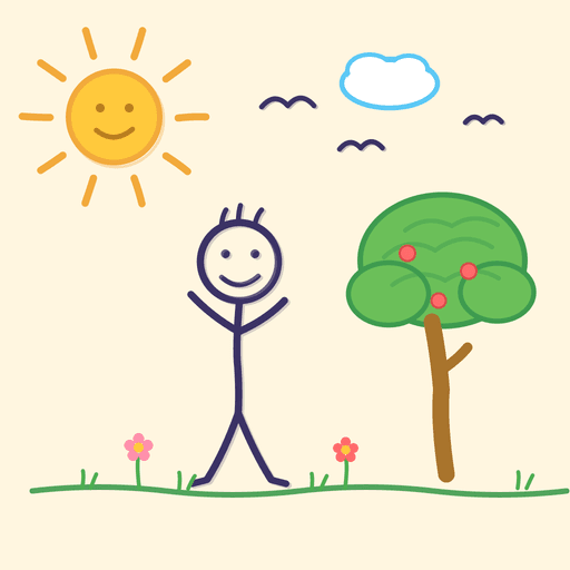
A crayon-drawn stick figure under a sun — hand-made, warm, a bit silly. The mark carries the app's whole personality in a single tile. It's also the one part of the identity that isn't built from tokens: it's a drawing, so it ships as a 512px raster and every other size is derived from it rather than redrawn.
Primary app icon · 512×512 · full-bleed
Keep breathing room of at least a quarter of the mark's width on every side.
Single-colour mark for the notification bar, watch faces, and stamps.
A crayon box
Six bright accents on a deep indigo ground, each with a job to do. They read like a child's crayon set — deliberately loud, always outlined in ink.
The app ships four selectable moods — same crayon accents, four different grounds.
Baloo 2, everywhere
One rounded, chunky typeface across the whole app — friendly, confident, never corporate. The soft terminals echo the crayon marks.
NOPQRSTUVWXYZ
abcdefghijklmnop
qrstuvwxyz 0123456789
Display & UI: Baloo 2 · Body: system-ui · Data: monospace
Warm, playful, plainspoken
Blipflip talks like an encouraging friend — never a brand. Short sentences, real words, a little emoji, zero pressure.
We say
- Do“Blip your day.”
- Do“Turn your phone sideways, hold to record, done.”
- Do“A friendly evening reminder has your back.”
- Do“Cut anything into a sticker.”
We don't
- No“Maximize your engagement metrics.”
- No“Grow your audience and go viral.”
- No“An error occurred (code 500).”
- NoAnything that shames you into a streak.
What I built
Photo-to-sticker cutouts
Built the photo-to-sticker flow from capture and preview to reviewing the cutout. Photos are resized and sent to an authenticated service for background removal, with native fallbacks where available. Online cutouts require an internet connection.
Native home-screen widgets
Built native widgets on both platforms — SwiftUI on iOS and RemoteViews on Android — with multiple size classes and a background refresh handler. Widgets needed their own lightweight design language distinct from the app itself, since they live on a user's home screen.
Local capture & cloud sync
Clips are saved on-device first, then uploaded in the background: media goes to Cloudflare R2, with Supabase Storage as a fallback, and metadata to Supabase. Sharing, recap rendering and online cutouts require an internet connection.
Authentication
Designed and built sign-in with email/password plus Google and Apple SSO, keeping onboarding to as few steps as possible.
Design approach
Being both designer and engineer let me iterate fast: Figma explorations went straight into working React Native components the same day, so I could feel where the ML latency or navigation friction actually was rather than guessing from a static prototype. The identity came out of the same loop — the ink outline and offset shadow started as a card style in the app and worked backwards into the brand, which is why every panel above is buildable from the same handful of tokens.
See it in the wild
Eight screens from the Play Store listing — the crayon world, in the hand.
Expo · React Native · TypeScript · Supabase · Cloud Run · Cloudflare R2 · Sentry
Status
Blipflip is available on the App Store for iOS and Google Play for Android. Download the app and start your own video diary.
Next case study: Panik! by SGAG